
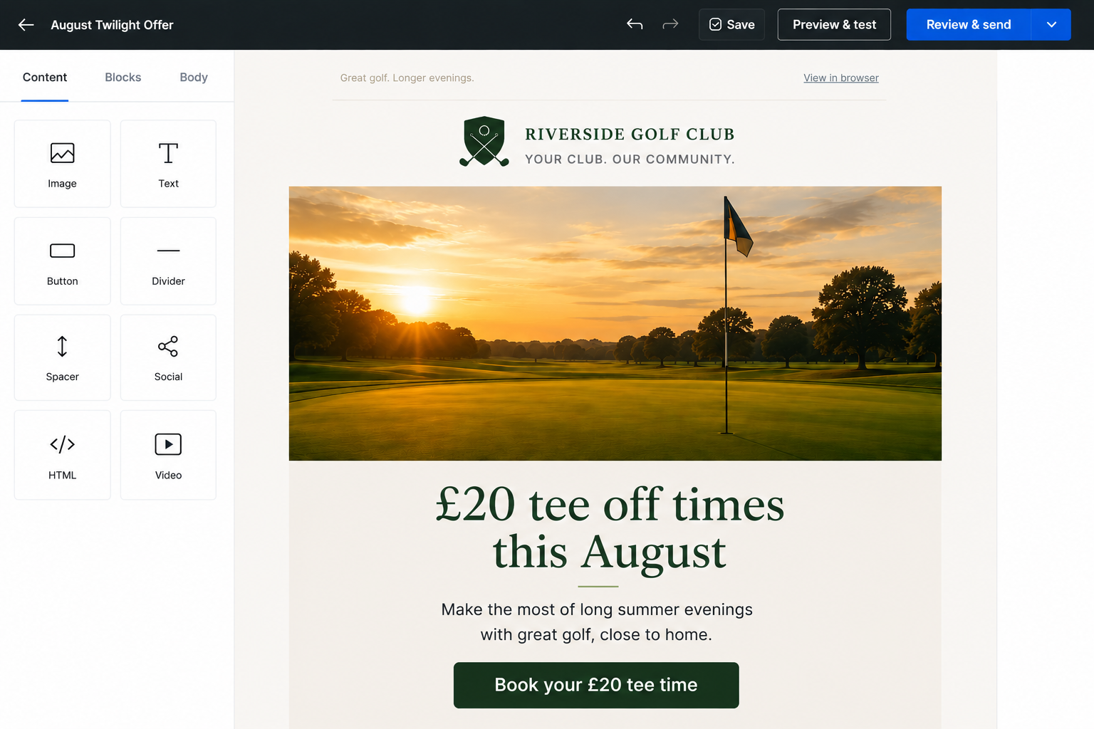
They say beauty is in the eye of the beholder, but what makes a beautiful email?
What is the objective of any marketing email?
Usually, we want the recipient to perform some sort of action – purchase, book, register, enquire, etc.
The best designed emails are the ones that make the information clear and provide interested recipients with a route to take action quickly and easily.
I often describe good email design as being ‘scannable’. I want users to extract the key information without having to intensely read lots of text.
We live in an attention economy. You only have a moment of attention with your audience, so we don’t want people having to work to consume the content.
This means:
- Clear headlines
- Short sections of text
- Plenty of spacing
- Obvious calls to action
We don’t want emails to feel cluttered.
The call to action is particularly important. If recipients are interested in what you’re offering, we want to direct them through as easily as possible.
Consistency is also important.
Your audience will get used to the emails you send. If you’re constantly changing layouts, styles and formats, it can make it unnecessarily more difficult for recipients to consume the content and take action.
Images can also play an important role.
A delicious plate of gourmet food can help sell a restaurant’s quality. A packed event can help create excitement. Genuine photography can provide reassurance and authenticity.
Generic stock photography, on the other hand, rarely adds much value.
For smaller businesses with a local audience, I would almost always lean towards authentic photographs taken during your day-to-day operations.
One of the most common mistakes I see is businesses placing all of the important information too far down the email.
For some recipients, the subject line alone is enough to drive action. To accommodate these users, I always try to include key information and a call to action near the top of the email.
If someone is ready to act, don’t make them hunt for the button.
All of my email designs are modular, meaning they can be expanded or shortened depending on how much content needs to be included.
It’s impossible to create a single layout that works for every business and every message, but the wireframe below is a good starting point.
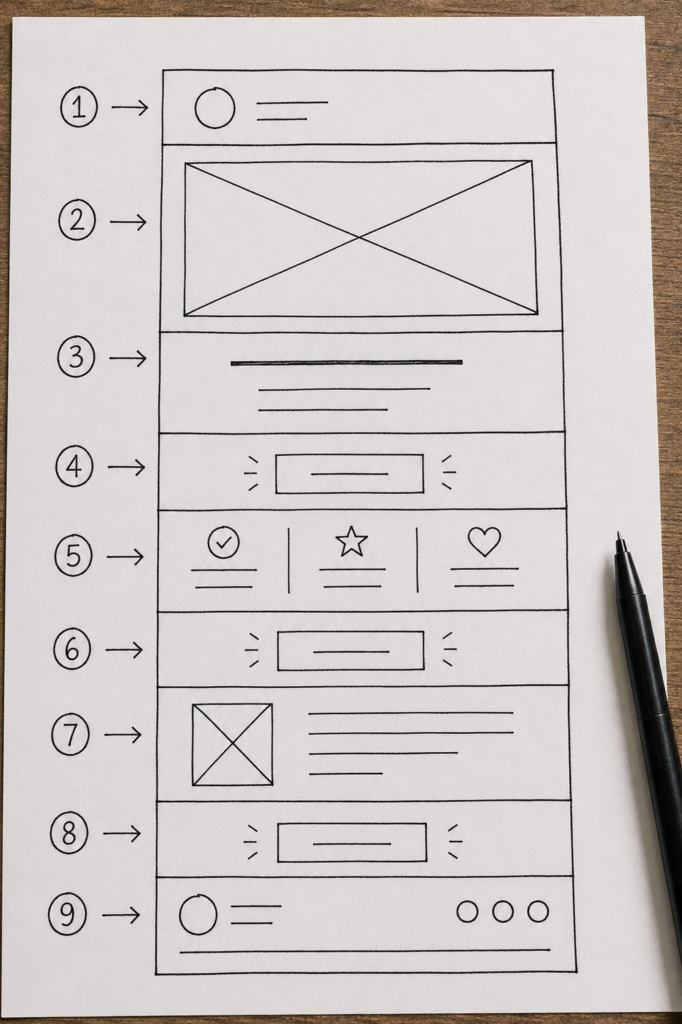
1. Consistent header with branding
Establishes authority and builds trust over time.
2. Feature image
Authentic imagery that adds visual reassurance to the message.
3. Headline & key information
We want users to understand the point of the message within a second or two.
4. Early call-to-action
Provide a quick route to action for motivated readers.
5. Further information
Additional details for those who need them.
6. Call-to-action
Another opportunity to take action without needing to scroll back up the email.
7. Additional information
Perhaps a secondary topic, event or supporting content.
8. Call-to-action
This could be the same action as above or a different action depending on the content.
9. Consistent footer section
This should include your company name, company number, registered address and an unsubscribe link. You can also include social media links where appropriate.
There is no single “perfect” email design. Every business is different and every message has different objectives.
What matters is making it as easy as possible for interested customers to understand your message and take action.
Good email design isn’t about being clever. It’s about being clear.